

Spatiotemporal analysis on GIS to identify Crash-prone Road sections
- Arpit Shah

- Jan 31, 2022
- 13 min read
Updated: Dec 12, 2025
1. Introduction

Spatial relationships strongly influence real-world events—whether in sports, safety, or geopolitics. In cricket (Figure 1), for example, Hotspot technology determines whether the ball touched the bat based on thermal signatures and spatial proximity.
I often recall the childhood game Hot & Cold. You hide an object somewhere in the house; the seeker tries to find it, and you guide them with cues—Hot meaning close, Cold meaning far. The thrill lay equally in concealing the object and racing to discover it before time ran out. And of course, the seeker always protested if they felt the clues were misleading 😄.
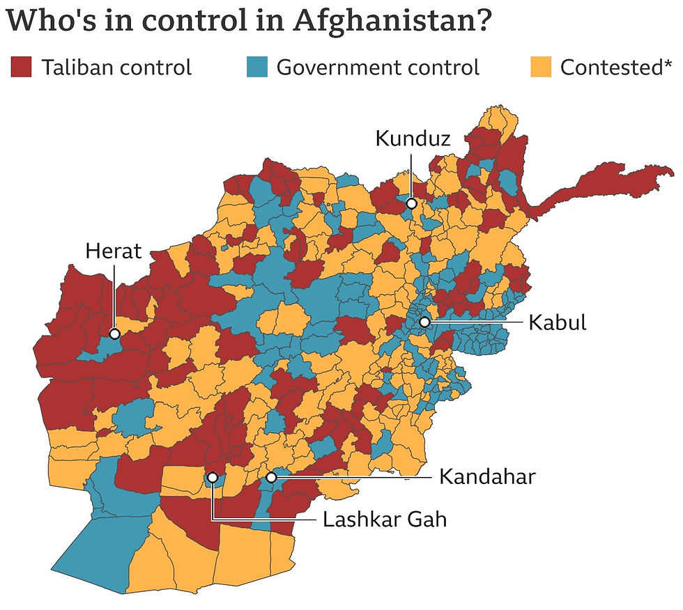
In Geographic Information Systems (GIS), spatial positions acquire meaning only when enriched with attributes. Consider Figure 2, which maps who controlled each province in Afghanistan during the 2021 Taliban offensive—coordinates alone say nothing; the attribute “controlling entity” tells the story.
In this post, I will demonstrate a real-world analogue of the Hot & Cold game—except here, the “clues” arise from statistics, not guesswork. Using Esri's ArcGIS Pro, an advanced Location Analytics platform, I perform Spatiotemporal Analysis of Vehicle Accidents in Brevard County, Florida (USA).
Much thanks to Lauren Scott Griffith & Lixin Huang for developing the original tutorial on Esri Learn ArcGIS.
SECTION HYPERLINKS
If you prefer a visual walkthrough, here is a 16-minute demonstration (I'd recommend you to read this post before watching it):
Spatiotemporal Analysis enables you to study data through both space (location) and time simultaneously. Before diving into the dual-dimension logic, you may benefit from two simpler examples—Spatial (Site Suitability Analysis for Wildlife Habitat) and Temporal (Detecting Ships in the Suez Canal).
For the crash analysis, I will use the following geoprocessing tools:
These two videos explain the methodology well:
Interesting, isn't it? Now to begin demonstrating its use...
2. Setting Up the Datasets & Initiating Location Analytics
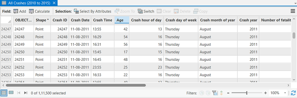
First, I load the dataset containing the coordinates and attributes of 100,000+ vehicle crashes recorded between 2010 and 2015 in Brevard County, Florida.
In addition to positional coordinates, the dataset contains attributes describing each crash—date and time, injuries, fatalities, contributing factors (alcohol, distraction, etc.), and weather conditions at the time of the incident (Figure 3 and 4). These are standard attributes collected by law-enforcement agencies worldwide, making this workflow broadly replicable.

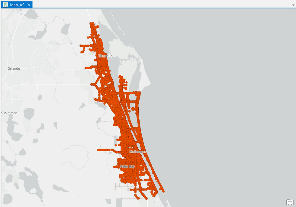
Once loaded, the crash points can be plotted on a 2D map:
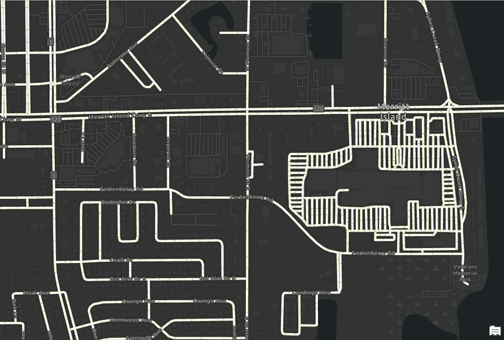
Alongside this, I load a second dataset: the digitized Road Network of Brevard County:
To prepare the data for spatiotemporal analysis, ArcGIS restructures the crash points into a Space Time Cube—a collection of Bins representing fixed spatial and temporal intervals.
To explain using an analogy, just as we use Pivot Table tool in Microsoft Excel to convert raw data into a more meaningful tabular summary, similarly, ArcGIS Pro is able to restructure the location dataset into manageable spatiotemporal units for analysis, i.e. Bins, using the Create Space Time Cube by Aggregating Points geoprocessing tool.

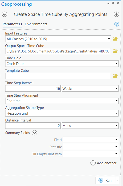
Using the said tool (Figure 8), I specify:
Spatial interval: 2 miles
Temporal interval: 16 weeks
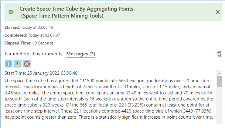
I choose not to map the cube immediately; instead, I review the output summary (Figure 9 below), which outlines how the crash data was reorganized into bins. The cube is saved on my system for the next step. Also, in the last phase of this demonstration, I will visually render and explain the processed Space Time Cube results in detail.
With the Space Time Cube ready, I now run the Emerging Hot Spot Analysis tool, also known as Space Time Pattern Mining.

This output does not simply show crash density. Instead, it evaluates the trend of crashes within each bin—a 2 miles cross-section over 16 weeks of time in this case—based on both:
patterns within the bin, and
patterns in neighboring bins (spatially and temporally).
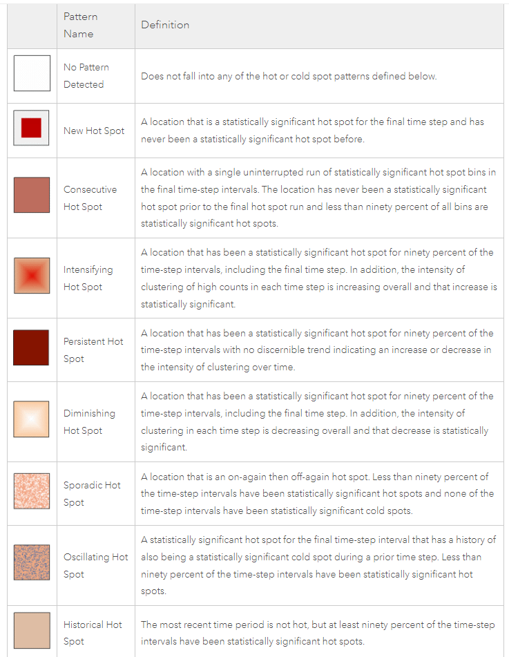
The trend for each bin falls into one of eight categories (description in Figure 11 below): New, Consecutive, Intensifying, Persistent, Diminishing, Sporadic, Oscillating or Historical Hot/Cold Spots.
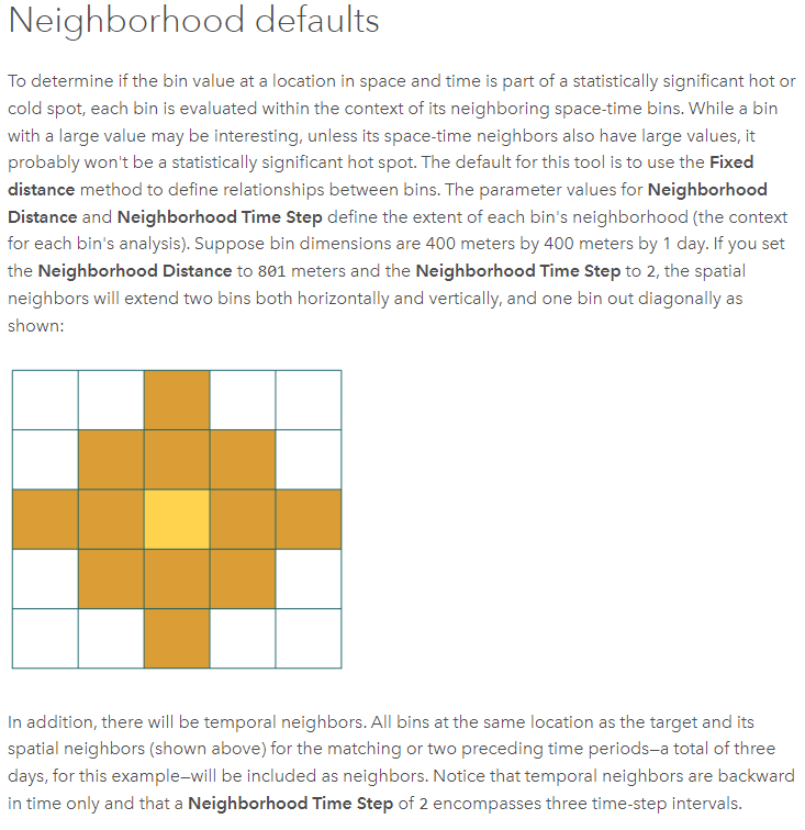
Next up, I will deploy the Emerging Hot Spot Analysis tool on the Count of Total Road Crashes over a single Neighborhood Time Step. Technical note on Neighborhood Time Step below:
Running the Emerging Hot Spot Analysis tool on the Count of Total Road Crashes over a single Neighborhood Time Step dataset yields this map:

Alongside the map, a Summary of Results table is also generated (Figure 14 below) which breaks down the 221 bins:
2 New Hot Spots
17 Consecutive Hot Spots
59 Sporadic Hot Spots
13 Oscillating Hot Spots
23 Persistent Cold Spots
18 Diminishing Cold Spots
3 Sporadic Cold Spots
These account for 135 Bins - the remaining 86 Bins are neither Hot Spots nor Cold Spots i.e. show no statistically significant pattern. (Figure 11 contains the description of each of these Hot Spot types)

The most common category (59 Bins)—Sporadic Hot Spot—indicates inconsistent yet recurring crash activity that isn’t strong enough to reflect a persistent trend.
However, for an analyst trying to find truly risk-prone zones, the focus should be on:
New Hot Spots (2 Bins)
Persistent Hot Spots (none in this dataset)
Intensifying Hot Spots (also none)
You may have observed that I have not factored in Brevard County's Road Network dataset in the Space Time Cube and Emerging Hot Spot Analysis steps. This is because the spatial distance between two bins (2 miles) used in that dataset is Euclidean, i.e., straight-line distance - it does not represent real-world travel distance i.e. using roads.
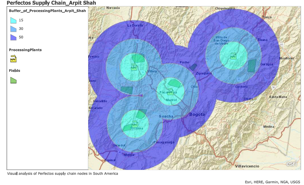
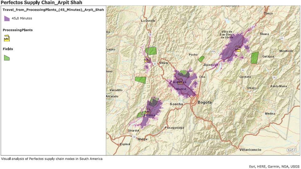
Figures 15 and 16 illustrate the difference between Euclidean and Road-Network-based service areas:
To make our crash-trend interpretation realistic, the Road Network must now be incorporated into the analysis. Before doing that though, I must fix an important issue.
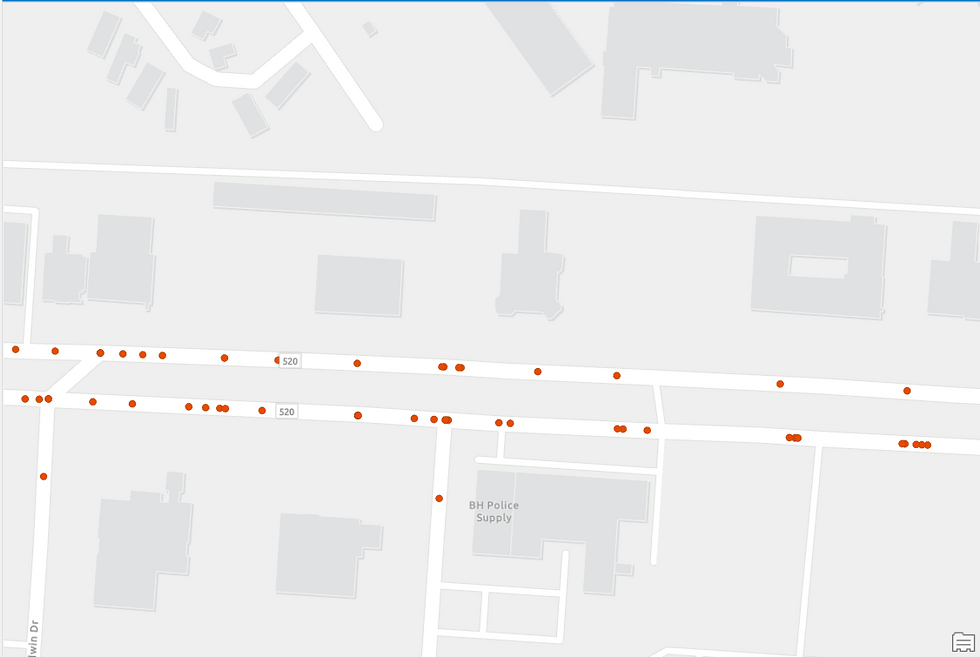
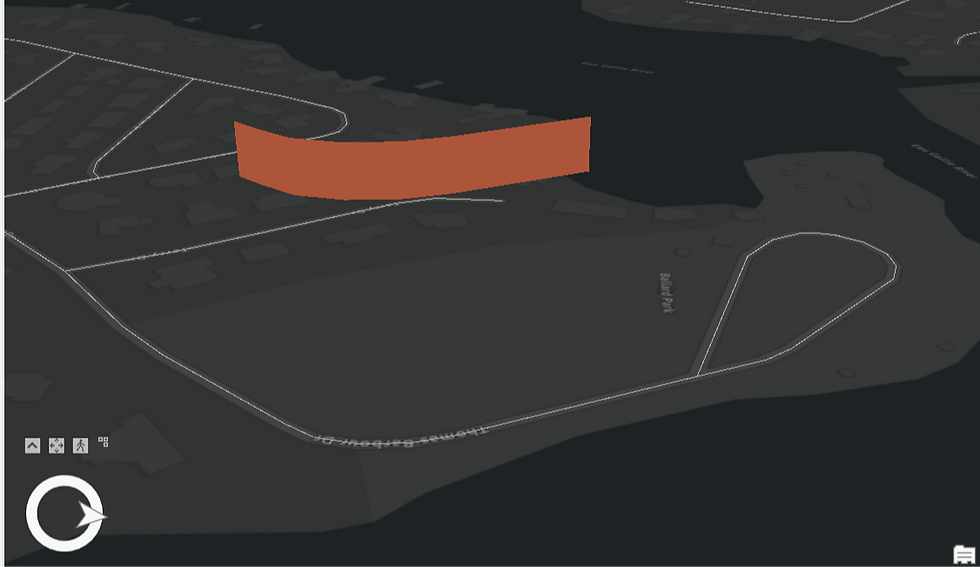
Some crash points do not lie directly on roads (observe Figure 17).
Reasons could include:
the recorded point marks the final position of the vehicle, not the collision point,
GPS inaccuracies.
Regardless of cause, these points must be corrected, or the Hot Spot Analysis will be distorted.


Using the Snap geoprocessing tool (Figure 18), I reposition all crashes within 0.25 miles onto the nearest road. Points farther away are assumed erroneous and ignored.
The corrected output (Figure 19) shows all crash locations now properly aligned to the road network:
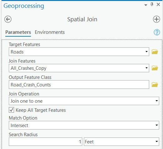
Next, I use Spatial Join geoprocessing tool to integrate the Crash locations dataset with the Road Network dataset.

As evident in Figure 21, the Crash locations dataset is now linked to the Road Network dataset.
I am now ready to run the Hot Spot Analysis tool again...
Or am I?...
Actually, no. One final adjustment remains.
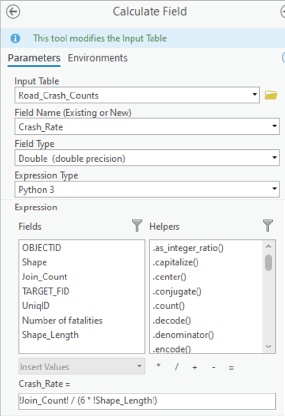
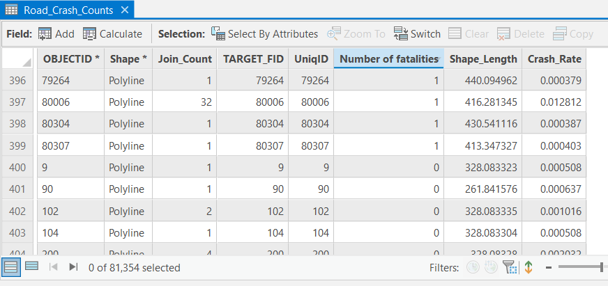
Longer roads naturally accumulate more crashes, which would bias the Hot Spot output. To avoid this, I compute a normalized metric:
Crash Rate per mile, per year.
Using the Calculate Field tool (Figure 22), I create a new field (Figure 23) that expresses crash frequency relative to road length—ensuring a fair comparison across the network.
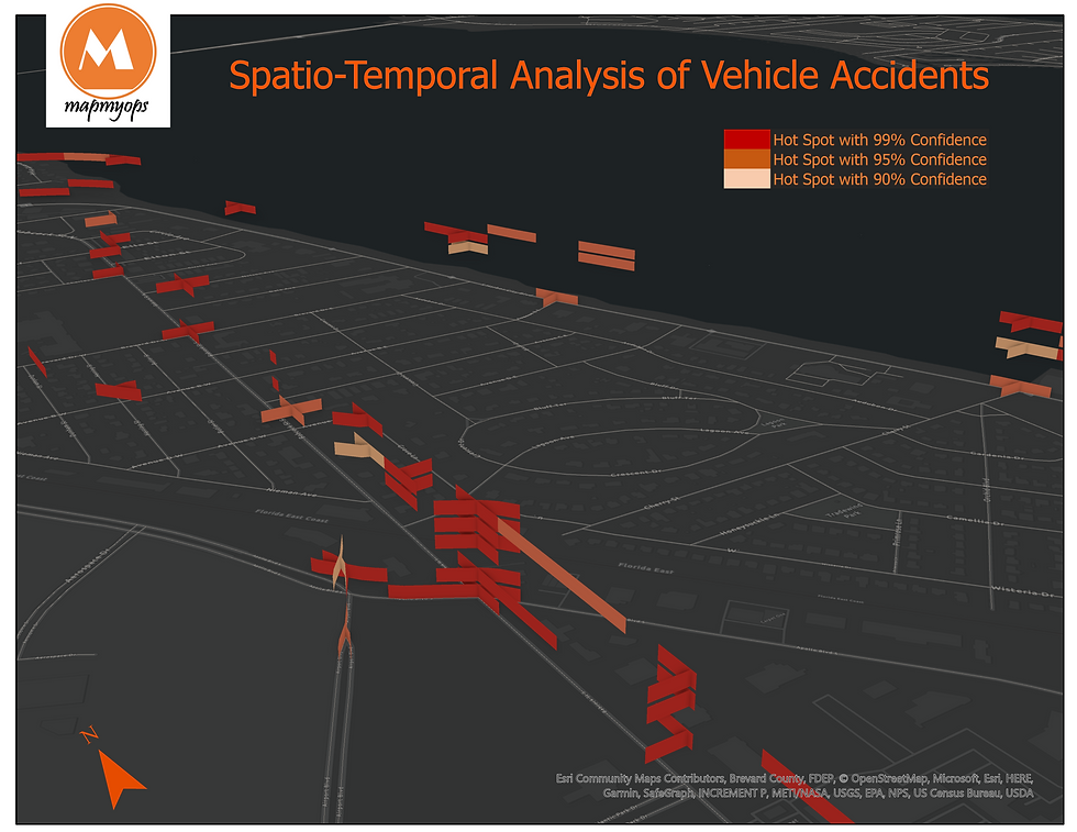
3. Performing Advanced Location Analytics using Getis-Ord Gi* Hot Spot method
Now that all irregularities have been resolved, I am finally ready to run Hot Spot Analysis again. This time, instead of using the Emerging Hot Spot Analysis tool, I will use the Hot Spot Analysis (Getis-Ord Gi*) tool. The Getis-Ord Gi* statistic allows me to spatially restrict the Hot Spot Analysis to the Road Network itself (Figure 26), rather than across the 2-mile Euclidean extent of each bin as before (Figure 13).
Before running the tool, I also want to assign weight not only to the exact location where a crash occurred but to the entire stretch of road where the sequence of events would have unfolded— from the point where a driver first recognized an obstacle to the point of collision. This provides a far more realistic representation of a crash-prone road segment.

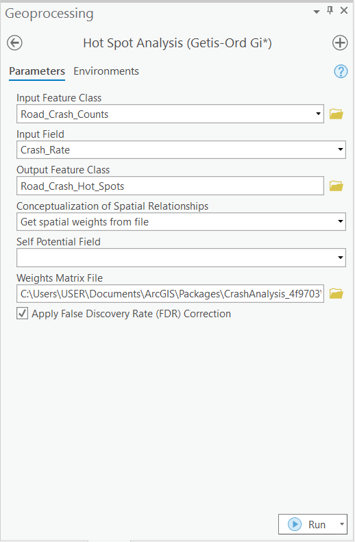
The length of this crash sequence—technically the Impedance Distance Cutoff—is set to 110 meters, equivalent to the length of an American football field. This corresponds to the minimum stopping-sight distance for a vehicle traveling at 45 mph, and will be used in the tool’s Conceptualization of Spatial Relationships parameter (Figure 25) to derive spatial weights.
(Technical note on generating spatial weights for network datasets is available here)
Upon running the Getis-Ord Gi* tool, the resulting Hot Spots now sit directly on the Road Network—a major improvement over the Euclidean output of the earlier Emerging Hot Spot Analysis (Figure 13):
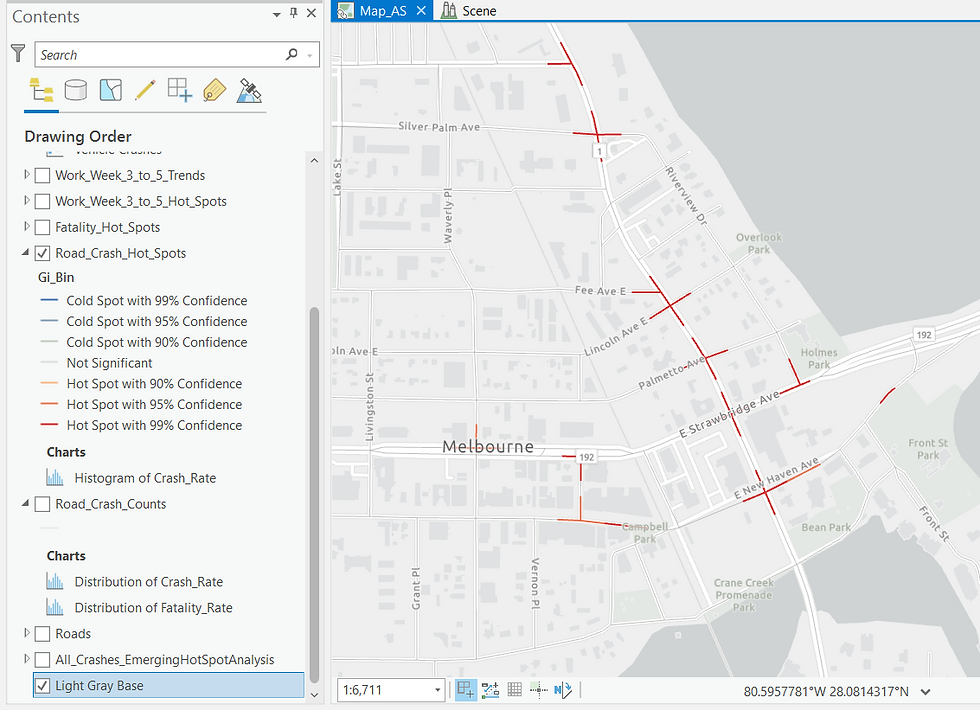
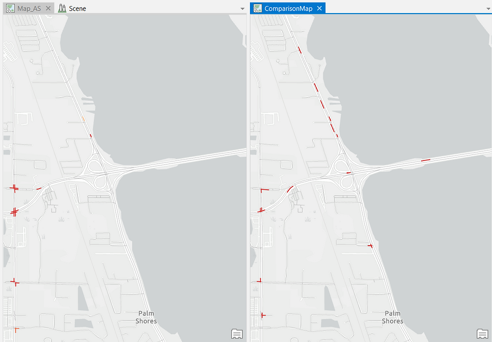
While Figure 26 depicts the hot spots derived from statistically analyzing all the Crash sites within Brevard County, let me refine the analysis by running the Hot Spot tool only on crashes that resulted in fatalities. The statistical method remains the same; only the input attribute field changes.
As expected, the Hot Spot output shifts noticeably. ArcGIS Pro allows me to compare both outputs side-by-side:

This comparison is revealing. Several new Hot Spots appear in the fatal-crash output (right) that were diluted within the larger set of all crashes. These represent high-risk road sections that warrant close attention from analysts and safety authorities.
Similarly, I repeat the process for crashes where the driver was under the influence of alcohol, and again compare it to the “All Crashes” output.
The alcohol-related Hot Spots cluster along the road running parallel to the river—an insight that could help law enforcement identify patterns of late-night riverside gatherings or drinking activity.
This form of spatiotemporal analysis can therefore support multiple stakeholders. Municipal authorities might prioritize widening fatality-prone segments, while police departments could ramp up checks near riverside pubs.
By cleaning and preparing the data carefully upfront, I also highlight an essential point: high-quality inputs are critical for producing accurate spatial intelligence outputs.
4. Modeling the Workflow to automate the Analysis
Modern GIS platforms are extremely dynamic. Let me now demonstrate how to analyze the crash records faster and in greater depth.
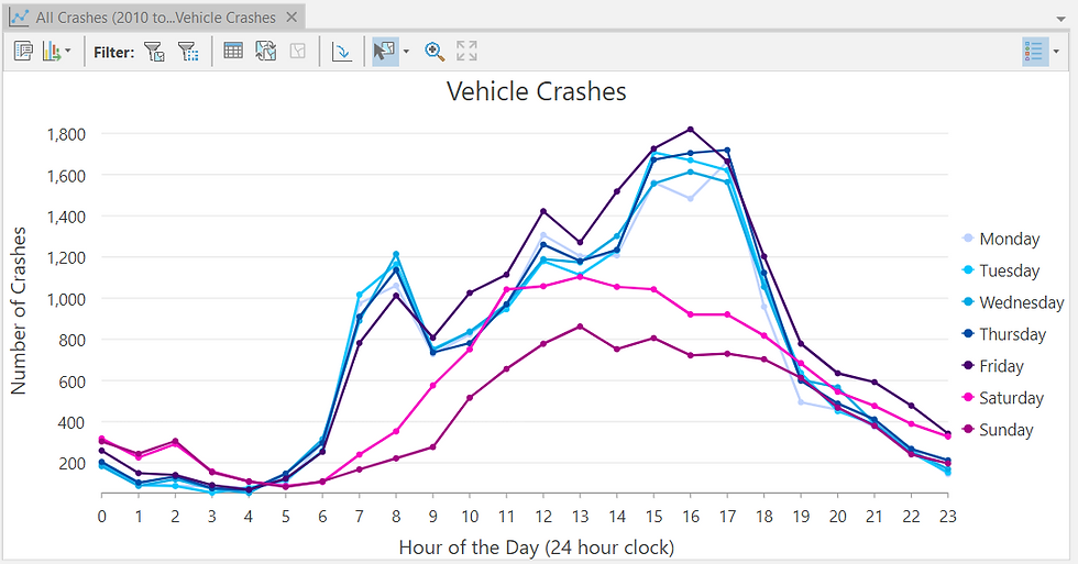
A natural next question is: During which hours of the day do crashes peak?
ArcGIS Pro allows me to generate Charts and Tables directly. Below is a line chart comparing three attributes: crash count, hour of day, and day of week.

Do you sense any patterns?
Now let me adjust the symbology—
Try once again. What can you assess?
The insight becomes clear: Crash incidents spike between 3 pm and 5 pm, especially on weekdays.
Given this discovery, I now run a new Hot Spot Analysis specifically for this peak crash window.
Instead of manually re-running every individual step, I automate the entire workflow using a ModelBuilder Analysis Model.

Although the model (Figure 31) may appear complex at first glance, it is simply a graphical representation of the workflow you have already seen. It automates four major steps:
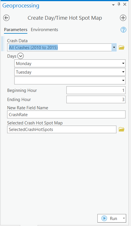
Selecting the crash attribute of interest
Snapping outlier crash points onto the correct road centerlines
Standardizing crash counts by computing crash rate per mile per year
Running the Getis-Ord Gi* Hot Spot Analysis
Such models are not difficult to configure, and often do not require any programming background. Their true power lies in enabling analysts to rapidly replicate workflows accurately and error-free, saving enormous time and effort.
After running the model for the peak crash window, I compare the results with the “All Crashes” Hot Spot output:
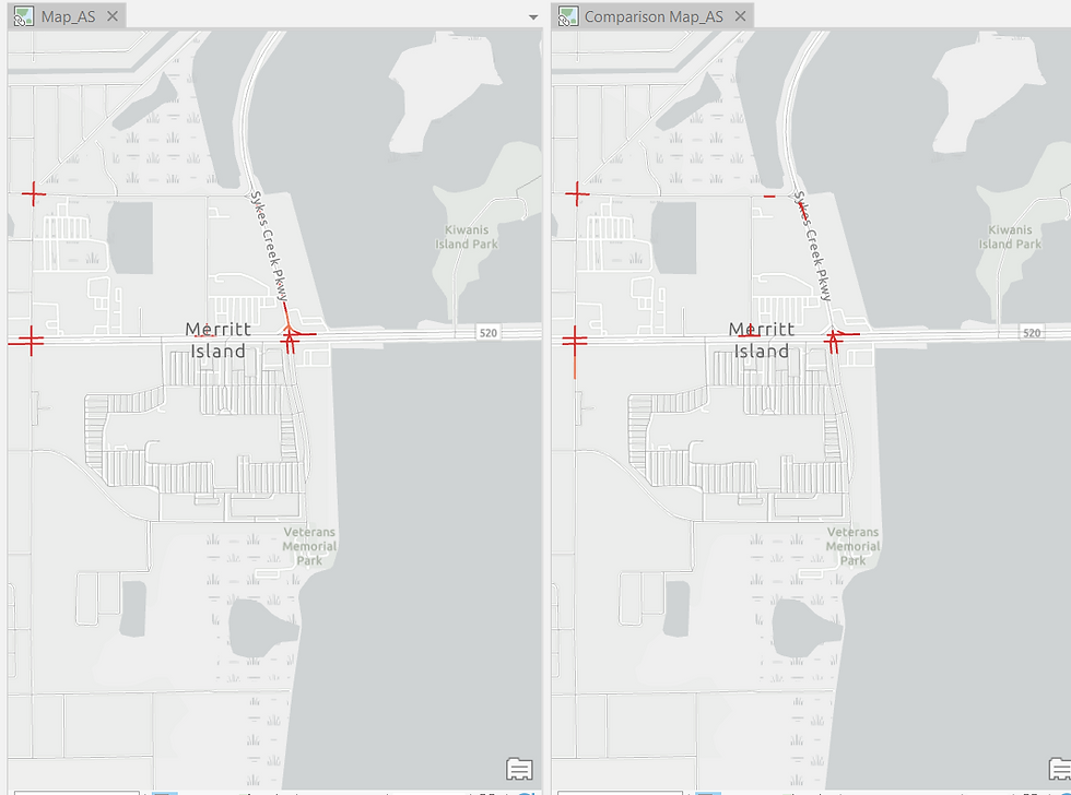
Once again, new Hot Spots emerge, and these locations deserve detailed investigation. They may correspond to busy commercial corridors or high-traffic commuter routes. Safety interventions such as signals, signage, speed breakers, or traffic controllers may be appropriate.
5. Visualizing the Results of Spatiotemporal Analysis in a 3D Scene
Now for my favorite part—and perhaps the most striking segment of this study: visualizing spatiotemporal patterns in 3D.
And no, you don’t need 3D glasses 😎.
So far, you have seen Hot Spots on a flat 2D map. While this reveals where crashes cluster, it does not show how these Hot Spots evolve across the six-year period of the dataset. A 3D scene allows us to visualize both space and time simultaneously.
First, I create Yearly Hot Spot Maps for each year from 2010 to 2015 (temporal analysis). To avoid manually repeating the workflow six times, I generate it using the Analysis Model (Figure 34):
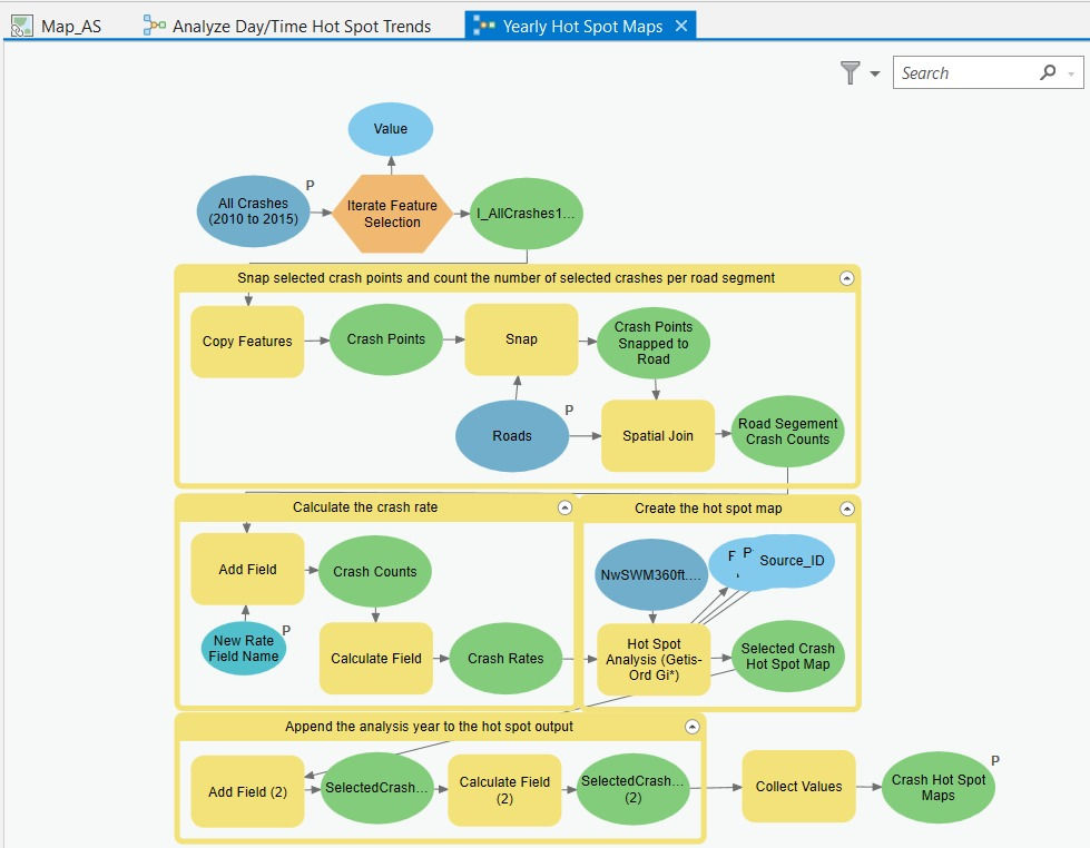
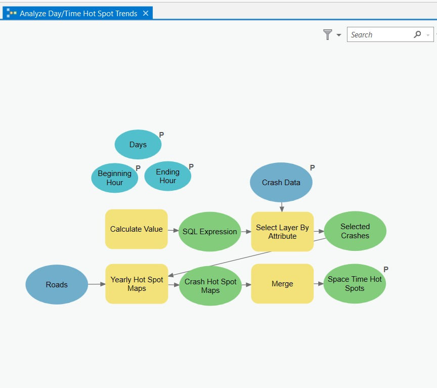
Next, I build another model (Figure 35 below) to perform Hot Spot Analysis specifically for the peak crash time window (3–5 pm on weekdays). The Yearly Hot Spot Maps produced earlier serve as inputs to this model (see the yellow input boxes).
Finally, I render the spatiotemporal output—year-on-year Hot Spots for weekday crashes between 3-5 pm—in a 3D Map Scene in ArcGIS Pro.
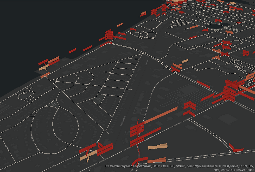
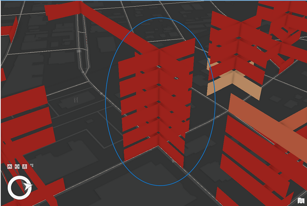
The output in Figure 36 may appear daunting at first glance. Let me walk you through what it depicts and how to interpret it. Refer to the highlighted portion in Figure 37 below-

At the highlighted intersection on Prospect Ave, you are seeing a Sporadic Hot Spot (refer to the earlier description). Recall that this Hot Spot type was the most prevalent in Brevard County when we ran the Emerging Hot Spot Analysis tool.
The interpretive pattern is as follows:
The first year (2010) displays a Hot Spot at the bottom of the stack. The dark red shade indicates a highly statistically significant Hot Spot (99% confidence).
In the second year (2011), the Hot Spot disappears completely—classified as not statistically significant, as shown in the legend.
In the third year (2012), the Hot Spot reappears with weaker statistical significance (light red shade representing 95% confidence).
In the fourth year (2013), it disappears again.
In the fifth year (2014), it reappears with maximum intensity.
And finally, in the sixth year (2015), the Hot Spot disappears once more.
This alternating pattern—appearing, disappearing, and reappearing with varying confidence levels—is characteristic of a Sporadic Hot Spot. I hope this clarifies how to interpret a spatiotemporal stack and appreciate its analytical value.
Now consider the next Hot Spot stack:
This is the classic pattern of a Persistent Hot Spot—consistently significant, consistently risky, and carrying a clear call for intervention.
And finally, this one-
Because the Hot Spot occurs only once across the entire six-year series and shows no recurring or intensifying trend, it falls under No Pattern Detected.
Thank you for taking the time to explore this detailed demonstration. I hope you enjoyed navigating through the spatiotemporal interpretation of crash Hot Spots. As always, feel free to share your feedback.
ABOUT US - OPERATIONS MAPPING SOLUTIONS FOR ORGANIZATIONS
Intelloc Mapping Services, Kolkata | Mapmyops.com offers a suite of Mapping and Analytics solutions that seamlessly integrate with Operations Planning, Design, and Audit workflows. Our capabilities include — but are not limited to — Drone Services, Location Analytics & GIS Applications, Satellite Imagery Analytics, Supply Chain Network Design, Subsurface Mapping and Wastewater Treatment. Projects are executed pan-India, delivering actionable insights and operational efficiency across sectors.
My firm's services can be split into two categories - Geographic Mapping and Operations Mapping. Our range of offerings are listed in the infographic below-

A majority of our Mapping for Operations-themed workflows (50+) can be accessed from this website's landing page. We respond well to documented queries/requirements. Demonstrations/PoC can be facilitated, on a paid-basis. Looking forward to being of service.
Regards,


