

Landslide Mapping technology - Risk Modelling and Rapid Detection
- Arpit Shah

- Nov 23, 2021
- 12 min read
Updated: Dec 12, 2025
SECTION HYPERLINKS:
Background
While the rapid slide of a large mass of snow is termed an Avalanche—a topic I’ve written about earlier—the same phenomenon involving rock, debris, earth or soil is called a Landslide, a calamity that affects us far more frequently, and often quite literally.
Landslides and Avalanches fall under the broader category of Mass Wasting events, which involve downslope movement of material under gravity. Mudslides, a faster and liquefied movement of debris and soil, form another devastating subtype of mass wasting.

Besides slope and gravity, factors such as rainfall, weak soil structure, and ground deformation significantly influence the likelihood of a landslide. These variables can be mapped using topographic, aerial, and satellite-derived datasets, and subsequently processed on GIS platforms for Landslide Hazard Analysis and Mapping.
Landslides are classified into six broad movement types—Fall, Topple, Slide, Spread, Flow, and Slope Deformation (Figure 1)—a system first proposed by David Varnes in 1978 and later refined by multiple researchers.
India encounters numerous landslide events annually. In just the first eight months of 2021, 61 incidents were officially recorded just within the first eight months of 2021. The Geological Survey of India (GSI) estimates that nearly 0.42 million sq. km (12.6%) of India’s non-snow-covered land area is susceptible to landslides.
To better anticipate these events, GSI has developed:
Region-specific Landslide Forecasting Models, with rainfall and slope as primary drivers
Site-specific Forecasting Models, supported by advanced sensors at eight locations across India
Since 90% of landslides in India are rainfall-induced, rainfall receives greater weightage in predictive modelling.
In this post, I demonstrate three workflows related to landslide analysis:
Building a Landslide Risk Model
Identifying at-risk population and infrastructure
Rapid Landslide Detection using Radar Satellite Imagery
A complete visual walkthrough of all three workflows is available here:
Workflow 1: Creating a Landslide Risk Model
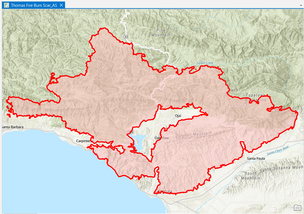
Landslide risk models must be periodically updated—particularly after earthquakes, wildfires, or episodes of heavy rainfall—because such events can drastically alter terrain characteristics. Here, I demonstrate the creation of a new risk model for an area that recently experienced a wildfire.
Workflow Credits: Learn ArcGIS
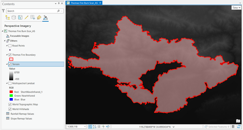


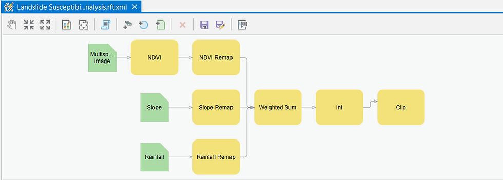
To combine these datasets, I construct a Geoprocessing Graph (Figure 7), which automates the sequence of operations:
But what do the processing steps entail?
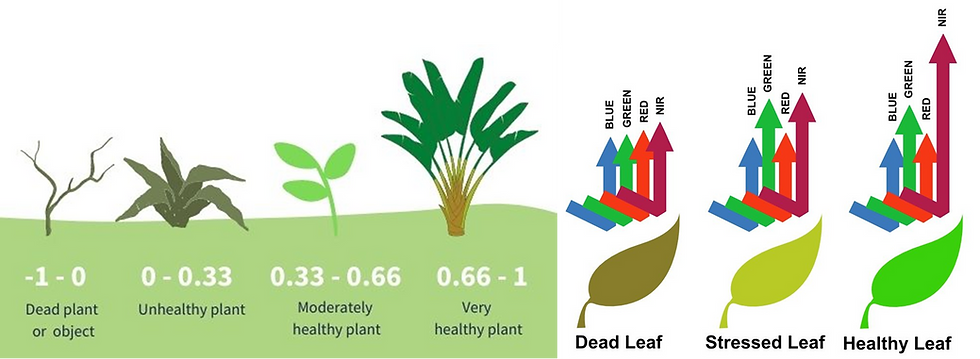
The first step extracts Normalized Difference Vegetation Index (NDVI), a measure of vegetation health derived from reflectance in the Red and Near-Infrared wavelengths, from the Landsat multispectral dataset. Healthy vegetation stabilizes the topsoil, whereas damaged or sparse vegetation—common after wildfires—leaves the soil prone to movement.
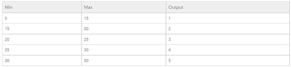
The Remap command is applied to all the three inputs. It helps to classify the pixel values into categorical ranges. An example is shared below-
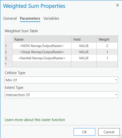
The Weighted Sum part of the processing chain allows me to combine the pixel values of all the three remapped layers into a new weighted value.
For this Landslide Risk Model, the remapped layers are combined using specific weights (as depicted in Figure 10):
NDVI — 50% (most critical after a wildfire)
Slope — 25%
Rainfall — 25%
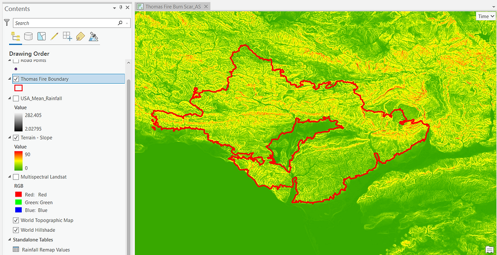
Finally, an INT command converts the weighted scores into integers, and a Clip operation isolates only the Burn Scar area, which is our region of interest.
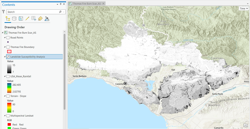
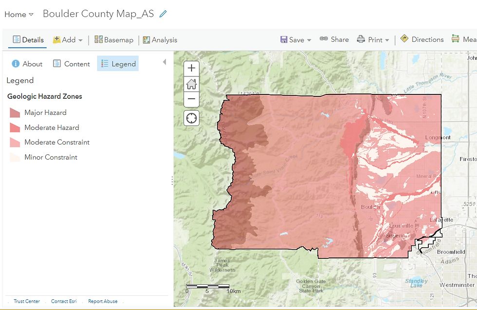
Upon executing the Graph model, the generated output is depicted in Figure 11 below. As can be seen in the Contents pane on the left, the Burn Scar risk scores range from a minimum of 7 (black) to a maximum of 15 (white). Higher the score, greater is the possibility of a Landslide occurring at that location.

This workflow illustrates how multiple geospatial layers can be integrated rapidly to produce an actionable Landslide Risk Model—provided the input datasets are of high quality.
Workflow 2: Analysing a Risk Model to identify populace at-threat
To demonstrate how a risk model can guide real-world decision-making, I first query a road traversing the Burn Scar to identify sections where the risk score exceeds 12 i.e. very high landslide risk.

For this workflow, I will analyse an already-prepared Landslide Risk Model for Boulder County in Colorado, USA to identify those resources that face a potent threat from landslides in the future, considering that a wildfire event that has recently occurred in this region. Also, be aware that a landslide is at its most threatening not at its origin but when a mass of mobile debris accumulate on a steep downslope
Workflow Credits: Learn ArcGIS


Let me hover around a few urban centres within Boulder County....
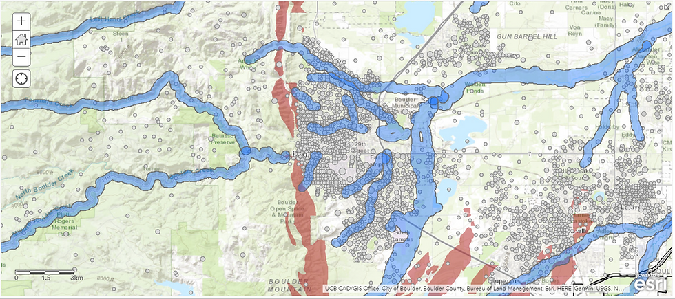

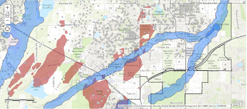
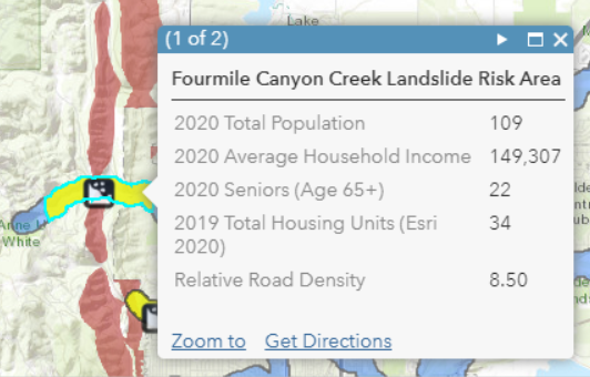
Using the Enrich tool, I add demographic attributes (population, households, elderly population, property density, etc.) to quantify the precise number of people at immediate risk.


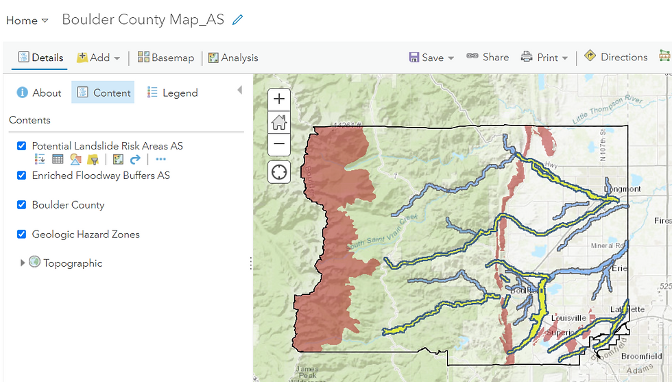
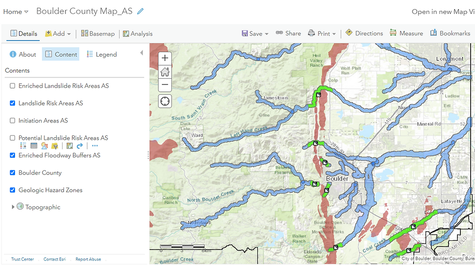
These green-highlighted regions are the critical threat zones. Enriching them with demographic and infrastructure datasets enables authorities to:
Prioritize rescue and mitigation
Identify vulnerable populations
Estimate potential economic loss
Strengthen preparedness and evacuation plans
In summary, this workflow demonstrates how a Landslide Risk Model—when paired with demographic, infrastructure, and hydrological layers—can reveal who and what lies directly in harm’s way.
Workflow 3: Detection of Landslide using Radar Remote Sensing
While the previous two workflows focused on building an early warning system and analysing it to identify at-risk populations, this final workflow demonstrates how to detect the exact location of a Landslide using Sentinel-1 Synthetic Aperture Radar (SAR) Imagery.
(As with the earlier workflows, this is a pictorial demonstration. If you wish to follow the full hands-on procedure in SNAP software, you may refer to the accompanying video tutorial.)
Workflow Credits: RUS Copernicus
You might reasonably ask why satellite-based detection is needed when landslides are now reported almost instantly on social media. The issue, however, is not the awareness of an event but pinpointing its origin and spatial extent—a far more challenging task in hilly, forested or remote locations, or in areas with no nearby human presence.
To detect a landslide using SAR, we analyse two Sentinel-1 SAR images acquired over the same area—one before and one after the suspected event. The technical methodology is known as InSAR (Interferometric Synthetic Aperture Radar). The core idea is simple yet powerful:
If the ground surface has shifted between the two acquisition dates i.e. deformation has occurred, the SAR signal will capture measurable changes in phase, coherence, and backscatter
Sentinel-1, with its 6–12 day revisit time, is well-suited for rapid monitoring.
SAR has several advantages over multispectral imagery for Rapid Landslide Detection:
Penetrates clouds and atmosphere due to long microwave wavelengths
Can be acquired at night, as the satellite is an active sensor
Sensitive to surface roughness, which increases after a landslide
Backscatter, phase and coherence changes are ideal for deformation detection
Multispectral imagery is valuable for validation, but not ideal for detection under cloud cover or poor illumination
The study area is Fagraskógarfjall, Iceland, which experienced unusually high rainfall during early July 2018.
Two Sentinel-1 images were used:
Pre-event: 23 June 2018
Post-event: 17 July 2018
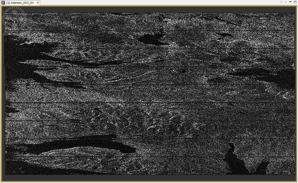
Below is an example of a raw SAR intensity image (VH polarization). While visually unappealing compared to optical imagery, SAR contains rich quantitative information.
A detailed step-by-step explanation of InSAR processing (Interferometry) is covered in my separate post on - Deformation Mapping for Volcanoes. Here, I present a concise overview.
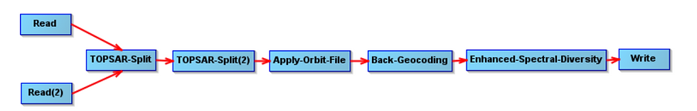
The goal of the first stage (Figure 26) is to clean and align both SAR images so they can be compared pixel-to-pixel. The result is a Coregistered Stack, where the pre- and post-event images are contained in a unified product.
Once coregistration is complete, we generate an RGB composite to highlight changes in backscatter:

To explain the output (Figure 7):
Green pixels: large increase in backscatter in the post-event image (indicative of increased surface roughness—key landslide signature)
Red pixels: higher backscatter in the pre-event image
Yellow pixels: similar backscatter in both dates
Black pixels: negligible backscatter (typically water bodies— refer specular reflection)
A distinct green blob appears in the RGB composite—our first evidence pointing to the possible landslide location.
To validate this first observation, the pre- and post-event intensity bands are compared side-by-side (Figure 28):

Next, the Interferogram operator is applied. This is the heart of InSAR processing, enabling detection of land deformation and measurement of ground displacement (the rate of uplift or subsidence) with centimetre-level sensitivity between the pre and post-event datasets, with centimeter-level accuracy.

The three interferometric outputs generated are the Intensity, Phase and Coherence bands:
Intensity - In a single raw SAR Imagery dataset, the Intensity value of a pixel is the square of the Amplitude where Amplitude is the reflected microwave energy from the Earth's surface, originally transmitted by and subsequently captured by the satellite itself. In the Interferometric output however, the Intensity value is derived by multiplying the Amplitude values for the same pixel across both the pre and post-event images within the Coregistered Stack.
Phase - In a single raw SAR Imagery dataset, the Phase value is a modified representation of the distance between the satellite's antenna and the ground target. As I am seeking to measure Displacement (the rate of uplift or subsidence), it is the change in Phase between both the images that matters to me. The Interferometric Phase band is exactly that - it captures the Phase difference i.e. subtracts the Phase value of a pixel in in one image from that of the other. This Interferometric Phase output is what is known as an Interferogram.
Coherence - Coherence quantifies the similarity of amplitude and phase values between the two dates. It is a measure of interferometric quality and is a normalized value ranging from 0 to 1 derived by combining the raw Amplitude and Phase values across both the imagery datasets. If the Amplitude values of the same pixel across both the Imagery datasets are similar and the Phase values of the same pixel are similar too, then Coherence assumes a value closer to 1 i.e. very high (minimal surface change). If the Amplitude as well as the Phase values across both the datasets are dissimilar, then the Coherence value veers towards 0 i.e. very low (major disturbance which can be attributed to vegetation change, soil displacement, water, snow etc.).
A landslide researcher is keen to observe whether there is a cluster(s) of pixels with low Coherence in the interferometric output - this is a telltale sign of Deformation.

The disrupted, ripple-like pattern in the Phase image above indicates ground displacement, intensifying our suspicious about a Deformation event to have occurred between the two dates.
The same region exhibits a cluster of black (low-coherence) pixels, signalling significant alteration of surface structure—consistent with a landslide.
Together, loss of phase and low coherence form a strong interferometric signature confirming a landslide at this site.
Finally, to verify the SAR-based detection, I use a natural-color multispectral satellite image:
Slider 1: Using a natural-color multispectral imagery to validate the SAR-detected landslide location
The visual evidence confirms that the detected location corresponds to the massive Fagraskógarfjall Landslide of 7 July 2018.
Fascinating, isn't it?
Summary of the Detection Logic
The landslide location was systematically confirmed through:
Green backscatter anomaly in the RGB composite (surface roughness increase)
Higher intensity in the post-event SAR image
Phase disturbance in the interferometric output (ground displacement)
Low coherence cluster over the same region
Optical imagery validation showing the landslide scargery
This workflow illustrates how SAR-based landslide detection is:
Rapid
Cost-effective
All-weather
Independent of sunlight
Suitable for remote, hazardous or inaccessible terrain
While replicating this workflow on recent landslides in Mizoram and Kerala, I was unable to detect the events despite multiple attempts. Two major issues emerged:
1. Low Spatial Resolution of Sentinel-1
Sentinel-1 IW mode offers 5 × 20 m spatial resolution (≈100 m² per pixel).This is adequate only for large-area landslides, such as in Iceland.
Smaller landslides require commercial high-resolution SAR satellites (eg. Maxar), which:
Offer finer spatial detail
Can task the satellite directly over the Area of Interest
Are not restricted to fixed revisit schedules
2. Moisture-Related Backscatter Suppression (The “Watery Dilemma”)
As explained earlier, water surfaces return negligible backscatter due to specular reflection. Since heavy rainfall and waterlogging frequently precede landslides, SAR images acquired around these periods often show:
Low contrast
Loss of coherence
Poor distinguishability between stable and disturbed terrain
States like Mizoram and Kerala experience near-continuous high rainfall, making it difficult to select “dry-season” images for comparison. Ironically, the very conditions that create landslides also impair SAR’s ability to detect them.
Thus, while InSAR is powerful, it is not infallible, particularly under highly saturated conditions.
I hope you enjoyed exploring the complete Landslide Hazard Mapping workflows—Risk Modelling, Risk Analysis, and Remote Detection. Geospatial technology continues to play an increasingly vital role in managing and mitigating natural hazards, and workflows such as these demonstrate both its immense utility and its practical limitations.
ABOUT US - OPERATIONS MAPPING SOLUTIONS FOR ORGANIZATIONS
Intelloc Mapping Services, Kolkata | Mapmyops.com offers a suite of Mapping and Analytics solutions that seamlessly integrate with Operations Planning, Design, and Audit workflows. Our capabilities include — but are not limited to — Drone Services, Location Analytics & GIS Applications, Satellite Imagery Analytics, Supply Chain Network Design, Subsurface Mapping and Wastewater Treatment. Projects are executed pan-India, delivering actionable insights and operational efficiency across sectors.
My firm's services can be split into two categories - Geographic Mapping and Operations Mapping. Our range of offerings are listed in the infographic below-

A majority of our Mapping for Operations-themed workflows (50+) can be accessed from this website's landing page. We respond well to documented queries/requirements. Demonstrations/PoC can be facilitated, on a paid-basis. Looking forward to being of service.
Regards,


