

Extracting Water Body Footprint using Multispectral and Radar Remote Sensing
- Arpit Shah

- Jan 7, 2021
- 17 min read
Updated: Mar 22
INTRODUCTION
Those who have read my previous posts (prior to 2022) on Remote Sensing or any news article on this topic for that matter would only be exposed to the final output derived from the processing of Satellite/Aerial Imagery and my/the journalist's interpretation and views related to it. The processing steps are typically, neither demonstrated nor explained. In a way, this does make sense - one would rather watch a completed piece of art and admire its beauty or be critical about its flaws rather than watch the artist make it painstakingly over a period of time. That being said, if you have encountered those entrancing time-lapse artistry videos on Social Media, you'd agree there is a lot of joy to be derived from watching the process of creating art as well, albeit in fast-forward mode.
Similarly, there is much to like about what goes behind the scenes in terms of processing Satellite Imagery - particularly because it tends to be explorative in nature - akin to an Archaeological expedition where probing the surface unearths artefacts along the way.
In this post, you will obtain insights about the process of analysing Satellite Imagery for the purpose of extracting Water Body Footprints. I will share a step-by-step depiction of the processing chain involved for doing so using two types of Satellite Imagery - Multispectral and Radar. Besides, you will also be exposed to the functionalities of SNAP - a popular and powerful Satellite Imagery Analytics software. The study area is a cross-section within Masurian Lake District in northeastern Poland - renowned for its 2000+ lakes within.
Because it is very challenging/resource intensive to plot the contours of a Water Body with cartographic precision from an aerial photograph /topographic survey, Satellite Imagery is typically preferred to do so as it helps save a lot of time, effort and money. A Water Body Footprint serves as a vital input dataset for multiple geospatial workflows - Flood Mapping, Water Level Mapping, Tidal Mapping, River Course Mapping, Glacial Studies, among others.
SECTION HYPERLINKS:

Multispectral Satellite Imagery for Earth Observation purposes is typically acquired passively - by capturing solar reflectances emanating from surface features on Earth across more than three spectral bands i.e. ranges of wavelength (Sunlight constitutes energy waves from the Visible Light, Infrared and Ultraviolet portions of the Electromagnetic Spectrum).
Synthetic Aperture Radar Satellite Imagery for Earth Observation purposes, on the other hand, is typically acquired through active illumination - the satellite transmits pulses of microwaves, which lie at the higher frequency-end of the Radio spectrum as seen in Figure 1 above, towards the earth and captures its reflectances (which is technically known as backscatter as the energy signals return in the same direction from where they were issued). As a result, this mode of acquiring imagery is also known as Microwave Remote Sensing.
Multispectral and Radar Satellite Imagery have their unique characteristics, advantages and disadvantages. While Multispectral Imaging responds to the biogeochemical properties of the surface, Radar Imaging responds to the physical structure, temperature and moisture content of the surface. And while solar radiation cannot pierce atmospheric constituents such as clouds and aerosols as the wavelengths which make up sunlight are small, microwaves have much longer wavelengths in comparison and can bypass these with ease, thereby rendering it suitable for acquiring information about the surface features on Earth at night, on cloudy/rainy days, and even in highly polluted areas.
Before I begin demonstrating the processing technicalities, know that sourcing Satellite Imagery datasets also requires a little knowhow - one needs to have clarity regarding the characteristics of the Imagery needed, desired Resolution, Timeline, Geographic Extent, where and how to acquire it and the cost of acquisition. For the study covered in this post, I have sourced Multispectral and Radar Imagery datasets acquired by ESA's Copernicus network of Earth Observation Satellites - these are free and accessible to registered users and more information pertaining to the process of doing so can be obtained from the video tutorials in this post of mine
Workflow 1: Extracting Water Body Footprint using Multispectral Satellite Imagery


Visualizing Multispectral Imagery in different modes/spectral band combinations helps one to understand the characteristics of the underlying surface at a macro-level. For example, the False-color Infrared visualization in Figure 3 above helps distinguish Water Bodies (blue) from Vegetation (red).

Satellite Imagery can be acquired raw or pre-processed. Pre-processed Imagery, if available, helps save up on computing resources and time . The three pre-processed masks in the figure above contain white pixels which are representative of snow, clouds and water respectively as estimated by the pre-processing Algorithms deployed by the Satellite Service (ESA Copernicus). This helps to interpret the Imagery better and exclude those pixels from subsequent analysis which may not be relevant for the study or whose processing can lead to inaccurate results (clouds & snow pixels in our case).

Just as it is applicable for Spreadsheet-based Analytics, one needs to clean and organize the Imagery dataset first before proceeding to do actual analysis on it. Sentinel-2 Multispectral Imagery dataset by default is multi-sized - it contains 13 spectral bands of information captured at 3 different spatial resolutions (10m, 20m and 60m). Prior to performing analysis for the Water Body Extraction workflow, it is necessary for me to make the product single-sized as SNAP does not support certain features for multi-sized products. Therefore, I have resampled the entire Imagery dataset to 10m resolution here for subsequent processing to function properly. Post resampling, the imagery dataset has been visualized, as depicted in the figure above, in MSI Land/Water mode (using B2, B3 and B8 spectral bands - all three have been originally acquired in 10m resolution).

To continue cleaning and organizing further, I have proceeded to remove certain components from the dataset which would not be relevant for this Water Footprint Extraction workflow. Raw Multispectral Satellite Imagery is large in size - the Sentinel-2 dataset which I am using right now is 1 GB in size and to process the entire Imagery is computationally-intensive and time-consuming. Therefore I have proceeded to Subset the Imagery.
Subset processing can involve-
clipping the Geographic Extent of the Imagery to the study area and/or
removing those Spectral Bands of information which are not useful for the study and/or
removing the Metadata information included in the Imagery product
Upon performing (1) Geographic Extent subset and (2) Band subset, the size of the dataset has reduces considerably - to below 100 MB. Now that I have cleaned and organized the Imagery dataset, I can proceed to perform the actual analysis on it to extract the Water Body Footprint.
Normalized Difference Water Index (NDWI) is a Remote Sensing indexing technique developed by S.K. McFeeters in 1996 which selectively amplifies the value of Water pixels in the Imagery dataset which makes it easier to demarcate the Water Body Footprint in a study area.

The derivation of the Index is straightforward - it contains basic arithmetic operations involving just a couple of spectral bands - although the rationale behind its derivation, which is to understand the technicalities of how different types of Electromagnetic Waves interact with different types of Surface features, requires a little domain knowledge.
Sunlight, the primary source of illumination in Multispectral Imagery, comprises Visible Light (which humans can see) as well as Infrared and Ultraviolet waves (which humans cannot). While Water reflects Visible Light about just as much as other common surface types such as Soil and Vegetation do, however, when exposed to Near Infrared (NIR) waves, it absorbs all the energy in this wavelength reflecting none at all (refer Figure 8 below). Hence, Water pixels appear dark i.e. have negligible pixel intensity in NIR wavelength. By contrast, Soil and Vegetation reflect NIR in moderate quantities and hence, the pixels representing these underlying features appear bright i.e. have high intensity in NIR wavelength.

This fundamental characteristic of surface features having contrasting reflective properties to different types of solar radiation wavelengths is what NDWI amplifies in order to make it easy to identify Water pixels, a cluster of which forms the footprint of a Water Body.
The reason why it is necessary to amplify the difference between contrasting surface reflectance properties is because while it is easy to identify a pixel of water in the middle of the ocean using NIR wavelength alone, it may be difficult to do so in shallow waters or around the coast where the water tends to be have high turbidity which results in some NIR to be reflected making the delineation tricky. Similar problem arises when the lake is surrounded by urban features which bounce off solar radiation in high quantities. Hence, by amplifying the contrast, it becomes easier to distinguish water features from land features.
What the NDWI formula essentially does is that it determines whether the Near Infrared intensity value of a pixel exceeds its Green wavelength (within Visible Light spectrum) intensity value or not. If it does, then the numerator and the final output will turn negative, implying it is a Land feature. If it does not exceed, then both the numerator and resulting output will remain positive, implying it is a Water feature and to distinguish one from the other (negative and positive pixel intensity) becomes more straightforward.

The image to the left in Figure 9 above is the NDWI output of the pre-processed Sentinel-2 Multispectral Imagery derived using the Band Maths tool in SNAP. The bright pixels have positive NDWI values between zero to one which corresponds to water whereas the dark pixels have negative NDWI values between zero and minus one which corresponds to land.
In the image to the right, in order to make the rendered output more black and white (literally), I've reclassified all the dark pixels into appearing jet black (by altering their negative NDWI values into no data values) and all the bright pixels as chalky white (by altering their positive NDWI values to the maximum value of one) using the Band Maths tool. This helps me to keep just the water pixels in the NDWI output which I will subsequently extract as the Water Footprint layer of the study area onto my desktop and use it compare it to the Water Footprint layer extracted from processing Radar Satellite Imagery over the same study area.
NDWI technique is not without flaws, though. As indicated earlier, if a water body lies next to an urban area for example, there is a possibility that the solar radiation reflectances from the latter affects the former. Hence, a few modifications to NDWI algorithm have been developed (refer Page 23 and 24 in this document) which enhances a researcher's ability to distinguish water pixels more precisely across different types of terrains.
Workflow 2: Extracting Water Body Footprint using Radar Satellite Imagery
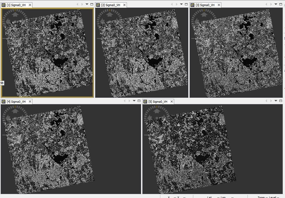
The way to process Radar Satellite Imagery to extract Water Body Footprint differs significantly from that of Multispectral Imagery. For starters, while I demonstrated the extraction of Water pixels using just a single Multispectral Imagery dataset, I will use multiple (five) Radar Satellite Imagery datasets (acquired between October and December 2020) to delineate and extract the Water pixels. The rationale behind doing so is explained later in this post. The spatial resolution of Sentinel-1 (Interferometric Wide) product is 5m x 20m i.e. each pixel represents 100 sq.m. area.
After performing Geographic Extent subset in order to make the file size smaller (same area as the subset applied on Multispectral Imagery), this is how a single, raw Radar Satellite Imagery dataset (Sentinel-1) looks like-

While the visual is a splattering of salt and pepper pixels, you'll be able to discern the presence of large Water Bodies in the image - where there is a distinct cluster of dark/black pixels.
Why are the Water pixels dark?, you may wonder.
It is because the microwaves emitted from the Satellite which go on to hit water features almost entirely reflect away from the Satellite i.e. do not return to the Satellite's receiver as backscatter. Hence, the recorded amplitude values for the pixels corresponding to water surfaces are virtually non-existent resulting in it being visualized as dark/black pixels.
By contrast, the microwaves which interact with common land surfaces such as vegetation, barren land, built-up area return as backscatter in moderate-to-significant quantities. Thus, the amplitude values of such pixels are higher and thus, appear brighter.

The next pre-processing step is to apply the latest Orbit files metadata to the five Imagery datasets.
A Satellite captures data as it navigates in its orbit. The Orbit Files within the SAR Imagery dataset contains the satellite's velocity and position information at the time of Imagery acquisition. Having accurate values for these helps in the precise assignment of backscatter to the pixels (known as Geocoding). It so happens that accurate Orbit Files takes a few days to be prepared by the satellite operator and therefore, the ones that come bundled with the dataset, particularly if the Imagery has been acquired very recently, may not be entirely accurate which would lead to imprecise assignment of backscatter to the pixels and negatively impact the output. As a result, it is recommended to update/apply the latest Orbit files to the dataset before one begins to analyze it.

My next pre-processing step is to apply Thermal Noise Removal. The Satellite's receiver which captures the radar backscatter also generates its own background energy which interferes with the reflectance readings and is incorrectly added to a pixel's intensity value (making it brighter than it should appear). This is not something that I would be comfortable with - as it directly interferes in the proper classification of surfaces features - a crucial aspect for this workflow.
Observe the Thermal Noise-corrected image closely (to the right in the figure above) - you'll notice that some pixels appear visibly darker than the pre-Thermal Noise-corrected version on the left. This is because the background noise of the receiver has been removed from the intensity value of the affected pixels using the Thermal Noise Removal tool on SNAP software.

The next pre-processing step is to apply Radiometric Calibration to the Imagery dataset.
Radiometric Calibration converts the digital backscatter numbers recorded by the Satellite's receiver into physical values reflected by surface features at source i.e. on Earth. This is done to negate the radiometric bias inherent in the digital numbers which requires constant offsets and other technical procedures as corrective measures in order to facilitate precise geocoding.
While this step is not important for Qualitative studies, it simply cannot be done without if one intends to quantitatively analyse multiple Imagery datasets for pixel-to-pixel comparison/change detection - something that I will need to in this Water Body Footprint Extraction workflow.

Next, I've applied another pre-processing step known as Terrain Correction.
The visualization of the assigned backscatter, is by default, done in Radar Geometry i.e. in the orientation of how the satellite receives information in its orbit and not how the features appear on the surface of the earth in terms of distance between surface features and Arctic Circle being located at the True North. As a result, the positionality/dimensionality of the visualization appears distorted. Terrain Correction tool helps to correct this distortion by applying Geographic Projection which transforms the visualization into how it appears on a 2D Earth Map.
Map Projections is a comprehensive topic by itself so I'll not delve into that. However, do observe the Terrain-corrected output in Figure 14 above - the output Imagery has been inverted as well as is narrower than the input Imagery (refer Figure 10). This is how the Masurian Lake District looks like on Google Maps in case you'd like to verify - you can also compare it with the Multispectral Imagery in Figure 9.
Next, instead of repeating these pre-processing steps on each of the remaining four datasets that I am using in this workflow - which will take considerable time and increases the chances of error - I will codify this processing chain using the Graph Builder tool and perform an automated execution of it for all the datasets together using the Batch Processing tool.


The last pre-processing step involves the usage of the Coregistration tool.
From the SNAP software's perspective, each of the five Imagery datasets that I have batch-processed are separate entities at the moment i.e. they are not ready for comparative analysis. Therefore, I have to join these datasets together into a Coregistered stack.

Notice that each of the five Imagery datasets are stored as an individual band in the stacked product. This signals to me that I can go ahead and perform the analysis to extract the Water Footprint using the Band Maths tool.
Albert Einstein appears to have famously remarked: If I had an hour to solve a problem, I'd spend fifty-five minutes thinking about the problem and five minutes thinking about the solutions.
I find this piece of wisdom to be particularly applicable for Remote Sensing workflows such as these. The actual analysis takes very little time to perform but the pre-processing steps are time-consuming and need to be done in an error-free manner in order to ensure that the data is cleaned and organized.

To deviate from the Water Footprint workflow slightly, Figure 19 above depicts a different Coregistered Stack comprising three of the five pre-processed imagery datasets visualized in RGB mode. While the rendered visualization appears like a natural-color photograph, it is actually a multi-temporal photograph through which one can observe the backscatter trend across the three timelines-
the black pixels represent those surfaces which do not have a backscatter across all the three timelines (likely to be water bodies),
the grainy salt-and-pepper pixels represent those surfaces which have a backscatter which has altered significantly across three timelines (likely to be forests or built-up areas)
the green pixels represent those surfaces whose backscatter has changed between the first and the second timeline (likely due to harvesting activity in an agricultural farm)
the violet pixels represent those surfaces whose backscatter has changed between the second and the third timeline (likely due to harvesting activity in an agricultural farm)
Isn't this a useful way to observe surface-level changes across multiple timelines in a single view!
Let me resume working on the Water Footprint workflow. My first analysis step will be to compute the Mean/Average of the intensity values of the same pixel location across all the five datasets and assign the output to the same pixel location in a new (sixth) band in the Coregistered Stack using the Band Maths tool. Doing so will help me to delineate the water bodies conclusively in the next step.
Besides, performing this step helps to even out inflated intensity values arising from any remaining noise present in the datasets that has not been eliminated in the previous pre-processing steps. This is exactly why I had opted to perform this Radar Satellite Imagery Analytics workflow for extracting Water Body Footprint using so many datasets - it becomes easier to balance out any intensity distortions, thereby facilitating precise feature extraction.


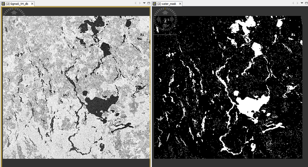
The final analysis step involves extracting the water pixels by thresholding the intensity values to demarcate it from land pixels.
However, it is not very straightforward to perform this step - refer the histogram of the intensity values of this new, averaged band in Figure 21. The values are so close to each other!
What is the way out?
As it turns out, there is a very nifty way to amplify the intensity values which would allow for convenient thresholding.
In Figure 22 below, observe that the dark pixels on the left image appear darker on the right image and the bright pixels on the left image appear brighter on the right image-

What has happened here?
I have log-scaled the pixel intensity values i.e. converted it from Linear scale to Logarithmic scale (dB=10*log10()). This has exponentially amplified the pixel intensity values which would make the it easier to delineate water pixels from land pixels.

Notice how the Histogram has changed in Figure 23 compared to what it was before in Figure 21. Now, it has become bi-modal i.e. has two peaks.
Given that we already know that water pixels would have less intensity values than land pixels, I can reasonably conclude that the pixels with intensity of less than minus 23.54 corresponds to Water bodies and those higher than it represent Land features.
Logarithms are useful after all! 😁
In order to delineate the water pixels using this intensity threshold of -23.54, I'll use the Band Maths tool in SNAP. And just as I had done in the Multispectral Imagery workflow previously, I'll proceed to reclassify the land pixels as null intensity values and all the water pixels as maximum intensity values of 1.This would allow me to extract just the Water Body Footprint of the study area.
Comparing both the Water Body Footprints
Lastly, let me show you how the two extracted Water Body Footprints, derived from processing Multispectral and Radar Satellite Imagery respectively, compare to each other-

I have used GIS software to merge both the Footprints into a single view, as is depicted in Figure 25 above. The violet pixels represent those pixels which have been classified as water in both the footprints - , most pixels fall in this category. The pure red pixels represent those pixels which have been classified as water only in the Multispectral Imagery Footprint whereas the pure blue pixels represent those pixels which have been classified as water only in the Radar Imagery Footprint. As you can observe, bulk of the pixels actually appear violet (mixture of red and blue) which implies that they have been classified as water across both the Footprints i.e. is largely consistent.
The reasons behind the inconsistent classification, wherever applicable (where a pixel is classified as water only in a single footprint) can be attributed to-
a) different timelines of Imagery acquisition - the Multispectral Imagery dataset was acquired during Spring season, whereas the Radar Imagery datasets were acquired during Autumn and Winter season. Therefore, the presence / absence of water could be consistent with the ground reality during that time period.
b) Multispectral and Radar Imagery analysis entailed completely different processing steps besides the fact that both the datasets were acquired in a different way (passive illumination through Sunlight v/s active illumination through pulses of Microwaves) and thus, have different intrinsic characteristics, advantages and disadvantages. Here's a comparative summary from the point-of-view of this Water Body Footprint extraction workflow in particular.
Do the Water Body Footprints correspond well to ground-truthed geospatial data?
See for yourself-
Slider 1: Multispectral/Optical (O) and Radar (R) Water Body Footprints overlaid on Google Map
I hope you enjoyed the process of performing Satellite Imagery Analytics (something that I had promised at the outset😊) just as much as you would appreciate interpreting this final output.
Thank you for reading!
ABOUT US
Intelloc Mapping Services, Kolkata | Mapmyops.com offers Mapping services that can be integrated with Operations Planning, Design and Audit workflows. These include but are not limited to Drone Services, Subsurface Mapping Services, Location Analytics & App Development, Supply Chain Services, Remote Sensing Services and Wastewater Treatment. The services can be rendered pan-India and will aid your organization to meet its stated objectives pertaining to Operational Excellence, Sustainability and Growth.
Broadly, the firm's area of expertise can be split into two categories - Geographic Mapping and Operations Mapping. The Infographic below highlights our capabilities-

Our Mapping for Operations-themed workflow demonstrations can be accessed from the firm's Website / YouTube Channel and an overview can be obtained from this brochure. Happy to address queries and respond to documented requirements. Custom Demonstration, Training & Trials are facilitated only on a paid-basis. Looking forward to being of service.
Regards,
Credits: EU Copernicus, RUS Copernicus & QGIS. Tutorial using older imagery can be viewed here.


